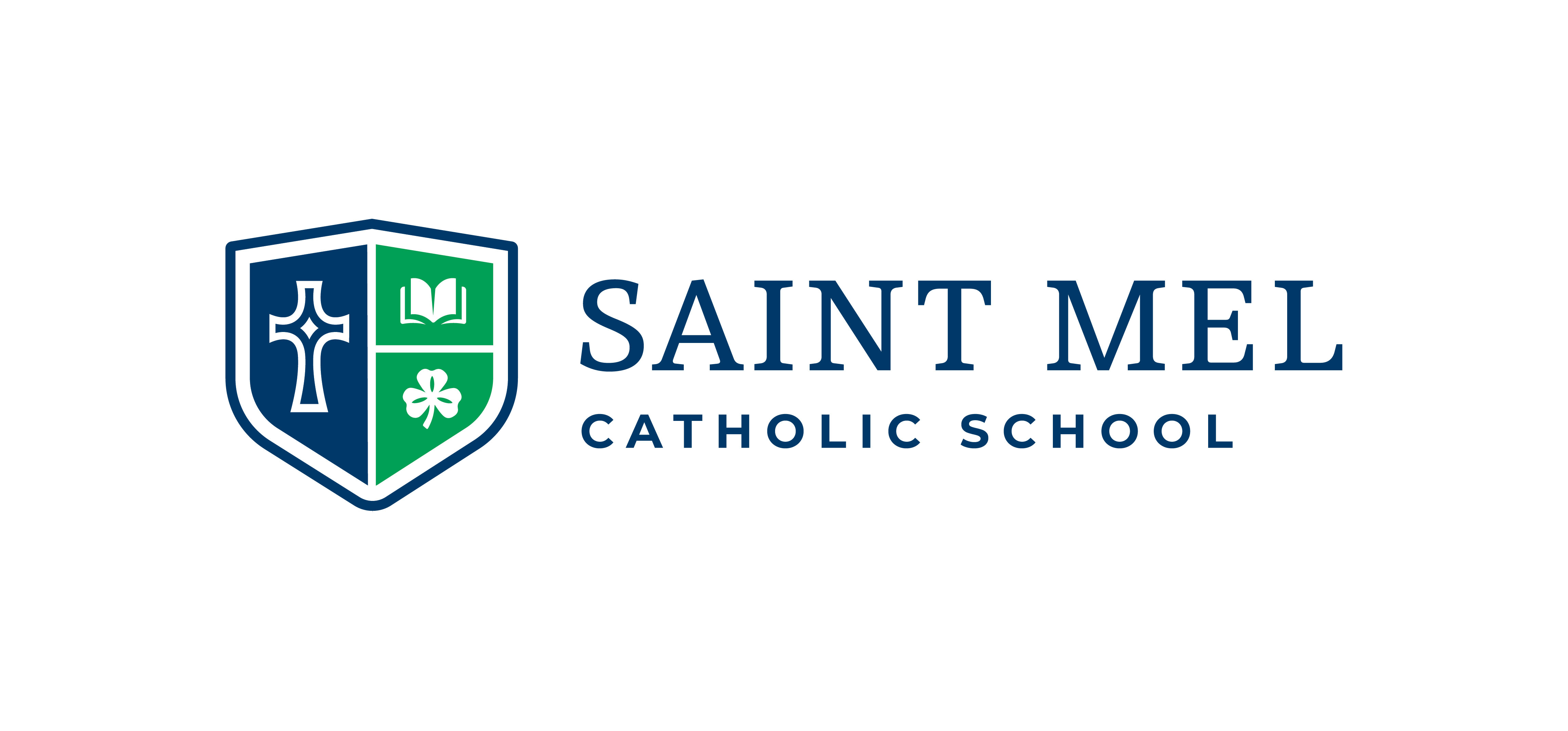
St. Mel School
How St. Mel School’s new brand reignited school pride
On the eve of celebrating their 65th anniversary, St. Mel School in Fair Oaks, California decided it was time for a fresh new look. While still honoring their Catholic heritage, they sought to create an updated cohesive brand that positioned their school as modern and innovative. We helped St. Mel School accomplish this goal with a new comprehensive brand identity, including a school logo, crest, and spirit marks.
The Challenge
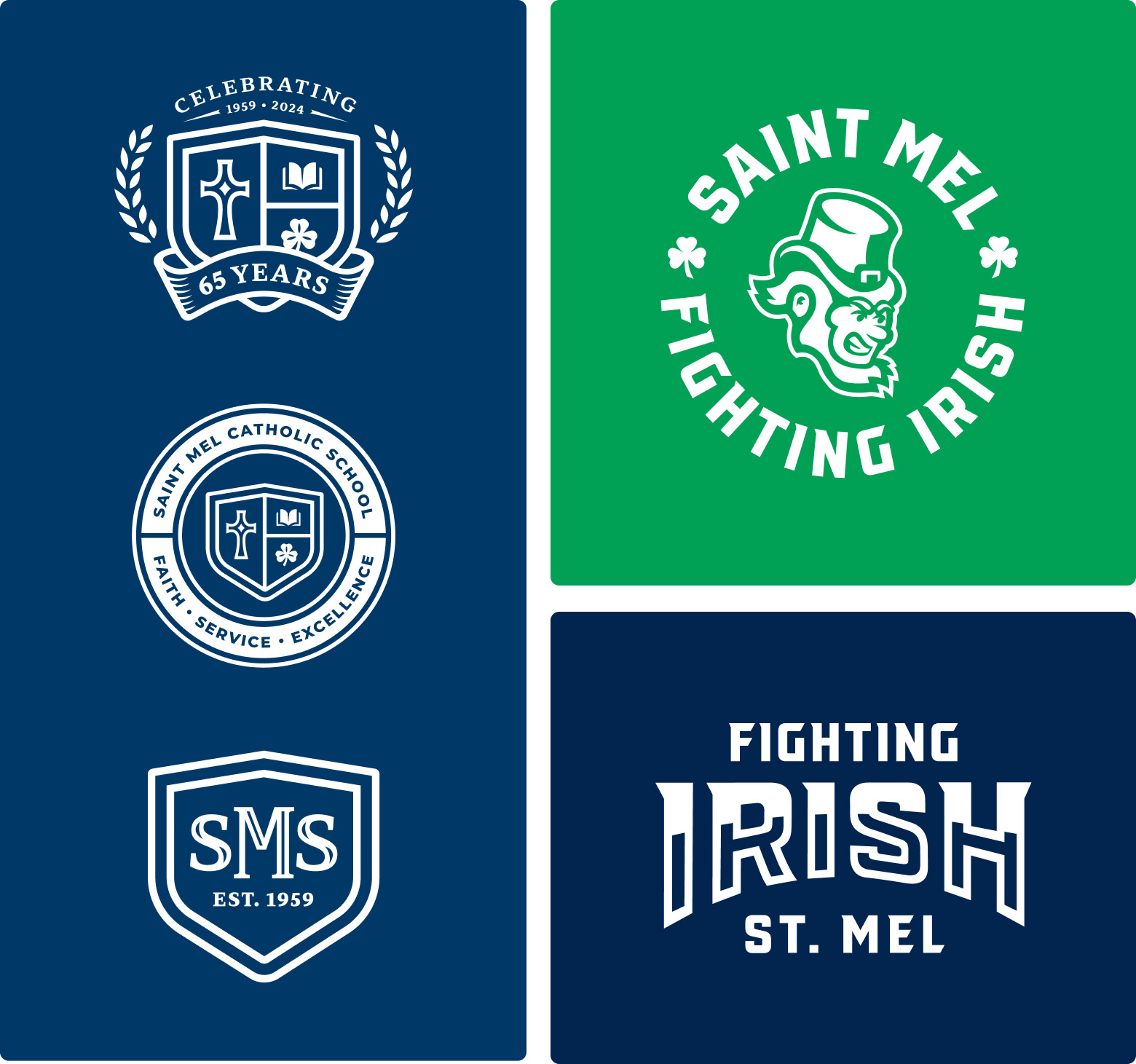
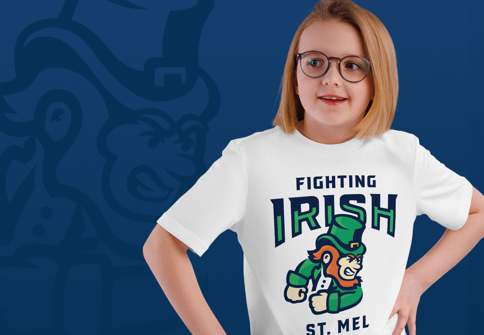
St. Mel School’s previous branding was outdated, inconsistent, and lacked clear guidelines. The new brand needed to reflect the school’s technological and curricular advancements while creating cohesive materials. A key challenge was the mascot—previously modeled after Notre Dame’s “Fighting Irish.” Research revealed permission hadn’t been granted, leading to the creation of a new, school-specific mascot design.
Client
St. Mel School
Services
School Brand Identity
Spirit Brand Identity
Comprehensive Brand Guide

Our Approach
Strategy Workshop
To kick off our branding project, we held an on-site strategy workshop with members of the Catholic School Advisory Committee (CSAC) from St. Mel School. In that workshop we focused on answering the following questions:
01
Background: We discussed the current brand to identify pieces that were important to retain and areas that needed improvement.
02
Uniqueness: We considered how St. Mel School stands out from local competition and why families choose St. Mel School over other Catholic elementary schools in the area.
03
Audiences: We identified the key target audiences for this rebrand and examined their needs.
04
Voice: We examined St. Mel School’s mission statement and the graphic elements that reflect their principles.
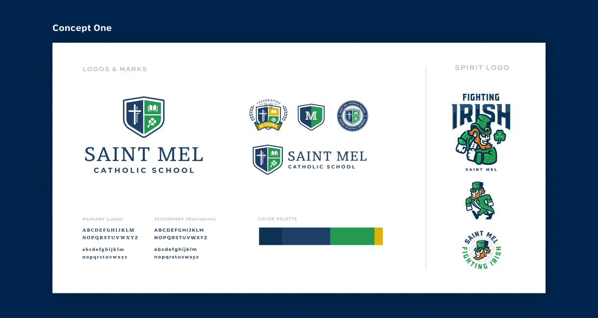
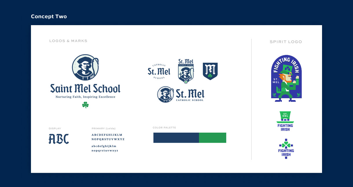
Concepting
Our team constructed three identity options that ranged from “young and innovative” to “classic and elite.” Once the visual direction was established, we refined a balanced rendition to create a final brand identity that functioned for all of St. Mel School’s intended uses.

The Solution
New brand identity and spirit mascot
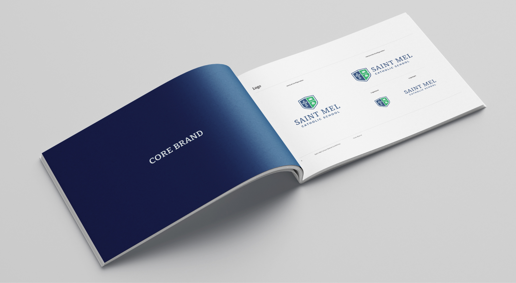
Our team worked closely with St. Mel School to design a new logo, school crest, and spirit mascot that met their needs. The logo is a balanced blend of youthful and classic elements, while the crest is easily readable and replicable across various mediums. Additionally, the spirit mascot now holds a distinct character that is unique to the school itself. With those in place, we built out a complementary system for the new brand, including refreshed colors, type solutions, icons, and photography.
Core Brand Colors
The primary brand palette for St. Mel School consists of a dark blue, vibrant green, and golden yellow. Blue was chosen for the Virgin Mary who is often depicted wearing blue, symbolizing being “full of grace” by divine favor. Green represents the school’s Irish heritage and yellow reflects their ambitions towards excellence and achievement.

Typography & Iconography
Bitter and Montserrat were selected for this typographic pairing. Balancing functionality with a bold personality, Bitter is a contemporary slab serif that is utilized for header treatments and quotes. Montserrat brings contrast and interest with its modern appeal, acting as the base for all body copy treatments.
A family set of icons were built out to further expand their brand’s personality and increase collateral versatility. The iconographic style utilizes full color to increase legibility and recognition. The style provides a friendly and approachable demeanor that aligns with the family-oriented institution and community.
Photography
Photographs play a vital role in capturing moments, emotions, and experiences that define St. Mel School. These are best represented by images that demonstrate students engaged in collaborative exploration, passionate teachers, and a welcoming academic atmosphere. Blue overlays on top of candid imagery are implemented to provide a clean, elegant environment for the school’s logo to shine.


Results
A cohesive and modern rebrand
St. Mel School’s previous branding was outdated, difficult to use, and lacked structured guidelines for designing unified collateral materials. Not only did the new brand need to establish intuitive consistency but also reflect the technological and curricular improvements made within the school.
The primary challenge revolved around the usage of their mascot logo. Like many other “Fighting Irish” mascots throughout the country, St. Mel School adopted the Notre Dame version, under the assumption that permission had been granted from the university. After thorough research, however, it was deemed necessary to craft a new mascot design specific to the local school.
Comprehensive Brand Guide
Branded Apparel & Merchandise


Ready to clarify your story?
If your business is ready to clarify your story and connect with customers, let’s talk. We’ll help you find the words, visuals, and strategy to stand out and grow.