SolTrans is a public transportation agency providing service to Vallejo, Benicia and neighboring communities. Their riders were questioning whether they were getting on the right bus, which led to many customer service calls and worse yet — people were choosing to NOT ride the bus. Multiple teams at SolTrans were operating in different directions leaving them with three different logos in use at the same time. This lack of brand consistency left riders questioning whether the bus they were boarding was going to get them home.
Our challenge was to refresh and standardize the brand so it felt familiar and build back trust with their riders. We couldn’t completely change their brand. We needed to ensure the rider experience was consistent and familiar.

Before: Various examples of confusing and inconsistent brand applications.
To kick off the rebrand, we facilitated a strategy workshop with their team to better understand SolTrans’ super powers of reliability, safety, and innovation. By focusing on the experience of each transit rider, we were able to connect to the heart of SolTrans.
Be instantly visible from long distances
Evoke a sense of lively energy
Convey a fun, reliable, diverse, and friendly look
Adaptable in black and white
We started developing a brand that said to riders, “That’s my ride home.” After a few rounds of development, the final logo was more able to express this theme across a wide variety of materials from handheld maps to large transit vehicle wraps.
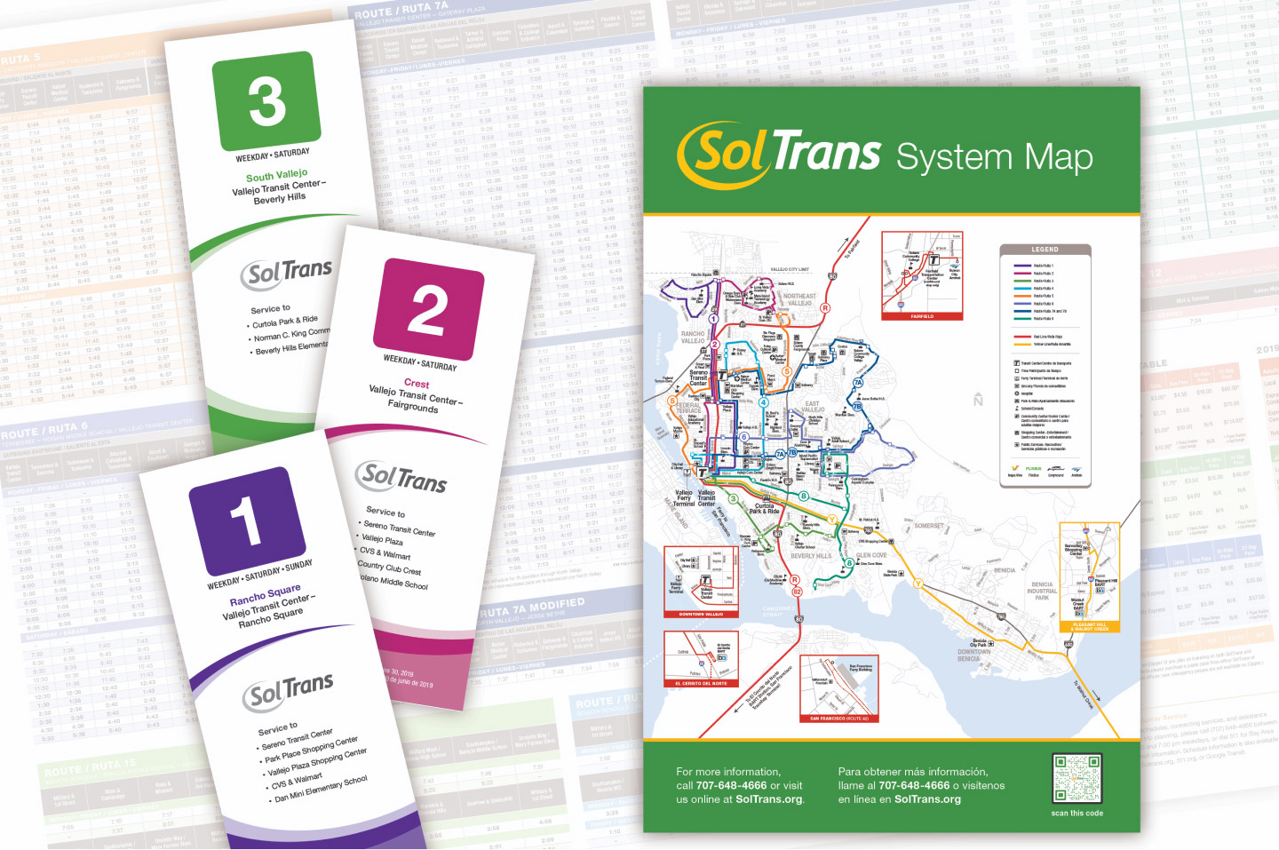
We created a single package of materials for their team to implement their revitalized brand. This package included a comprehensive brand guide including instructions on proper logo usage, type treatments, and brand colors. Then we designed collateral using the new system, including bus graphics, maps, bus passes, and signage.

The primary brand palette for SolTrans consists of a lively yellow, energizing orange, and eco-friendly green. Both the yellow and orange were chosen for their warmth and sunny radiance. Due to Solano County’s surrounding ecosystem and focus on clean energy, green was included as a calming balance to the trio.
Helvetica Neue, in its normal and condensed versions, was chosen for its clearly defined letterforms and ease-of-use when implemented. Its legibility and wide range of weights and styles provide flexibility with a contemporary feel.

The previous SolTrans brand lacked the cohesive brand presence that riders could easily identify. This more flexible brand redesign has had a positive impact on their staff and stands out to their riders amidst the hustle and bustle of city life.
Comprehensive Brand Guide
Bus Passes, SIgnage, and System maps

Website


