California Rice Commission
Balancing agriculture and environment
For decades, the California Rice Commission (CRC) has championed the state’s rice industry, celebrating its heritage, supporting its growers, and advocating for its future. As the story of California rice evolved, so did its mission. Beyond the fields, rice became a symbol of environmental stewardship, sustaining millions of birds and wildlife across the state. Page Design Group partnered with CRC to craft a refreshed brand and website that honor this legacy while bringing its powerful ecological story to the forefront.
Client
California Rice Commission
Services
Branding
Website Design
Messaging
The Challenge
Honoring the past, reflecting the future
The California Rice Commission had long been recognized for its deep roots in the agricultural community, yet its visual identity no longer captured the full story of what the organization had become. California rice has evolved into something greater; a vital part of the state’s ecosystem. CRC needed a brand that reflected this transformation while preserving the trust and recognition built over decades. Beyond the logo, the organization needed a unified framework, clear messaging, flexible brand guidelines, and a modern website to share its renewed purpose with farmers, policymakers, partners, and the public alike.

Stylescapes
Establishing an art direction upfront allows our team to connect with the client of the visual style that speaks to them and strengthens their messaging.
Logo Sketches
Sketching out rough ideas allows us to test out more concepts with low investment, giving the client more flexibility and options.
Logo Design
Once a direction is chosen we are able to refine and expand on the concept, breaking down key parts that give it meaning.
Our Approach
Building a brand that connects community and conservation
01
Understanding the legacy
We began by immersing ourselves in CRC’s history, mission, and audiences to uncover what elements of the brand should be preserved and where evolution was needed.
02
Clarifying the message
Through collaborative workshops and interviews, we distilled key insights into a brand messaging framework that clearly articulated CRC’s purpose, values, and environmental impact.
03
Exploring creative directions
Logo sketches and stylescapes helped visualize tone, color, and personality early in the process, allowing the team to align around a shared creative vision.
04
Collaborating with intention
Working hand-in-hand with CRC leadership, we refined ideas, balanced perspectives, and ensured every design decision honored the organization’s heritage while embracing its future.
05
Building a flexible system
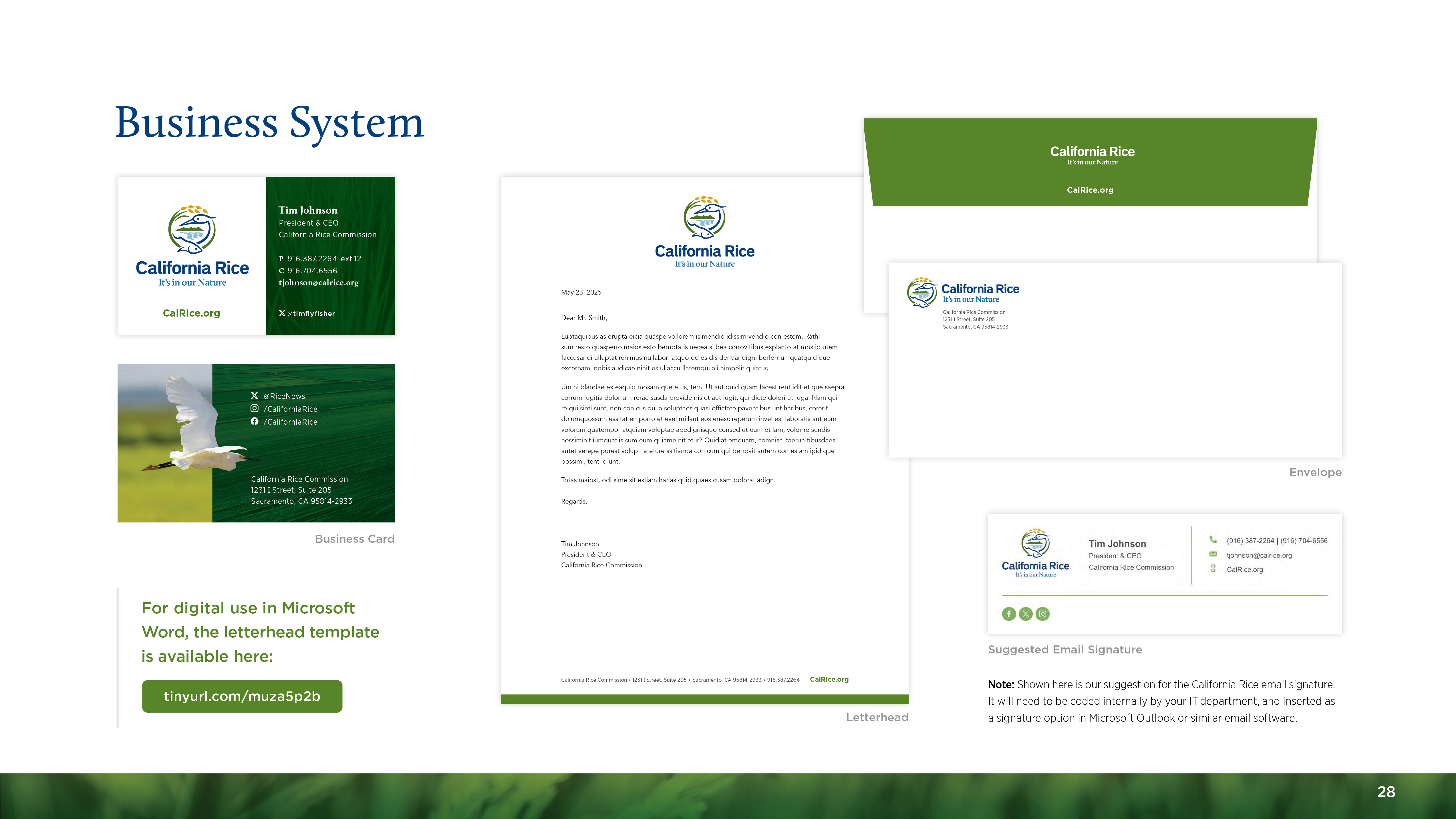
The final toolkit included brand guidelines, templates, and digital resources, equipping CRC with a system that ensures consistency while remaining adaptable for advocacy, education, and outreach.


The Solution
A refreshed identity for an expanded mission
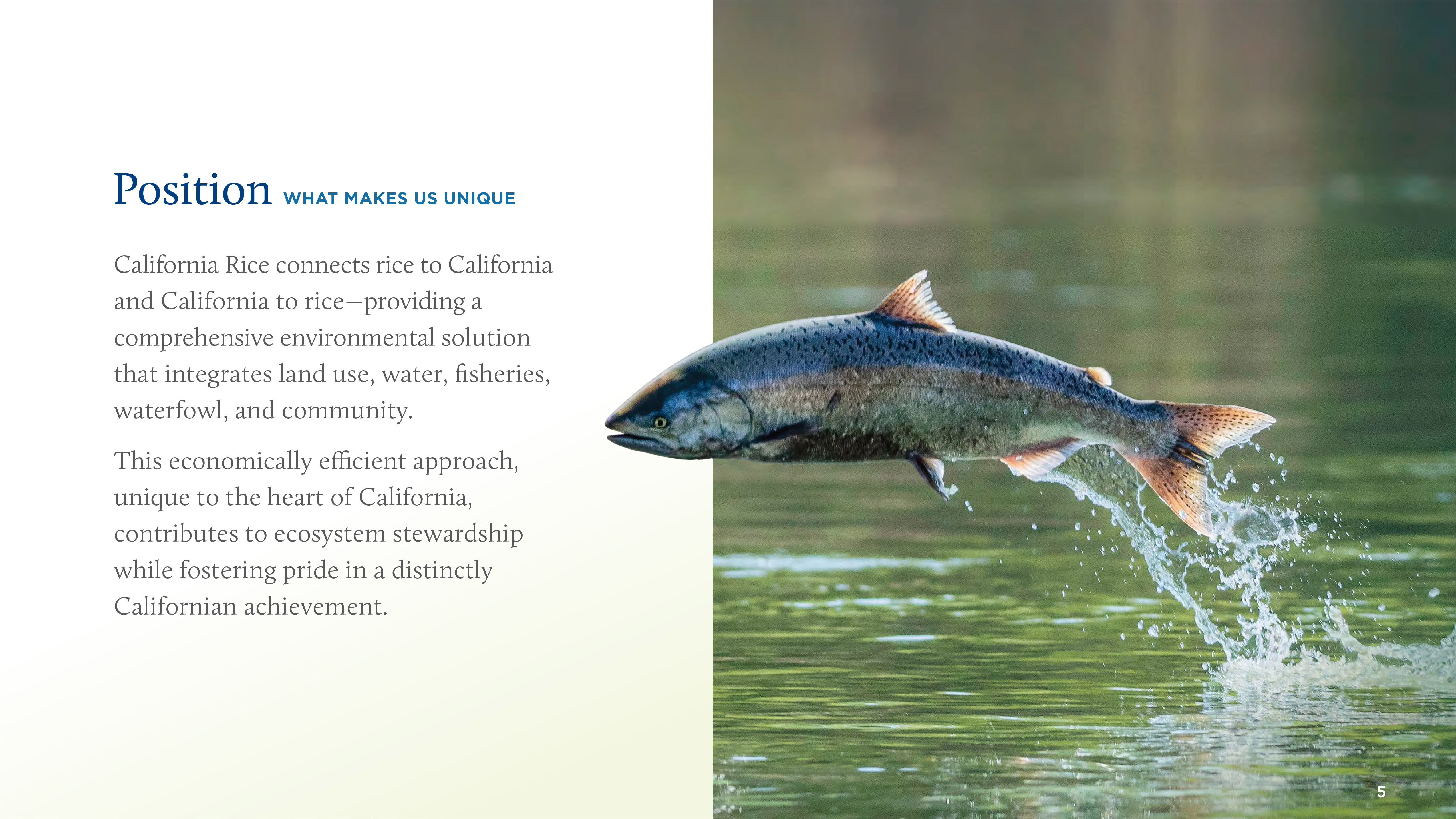
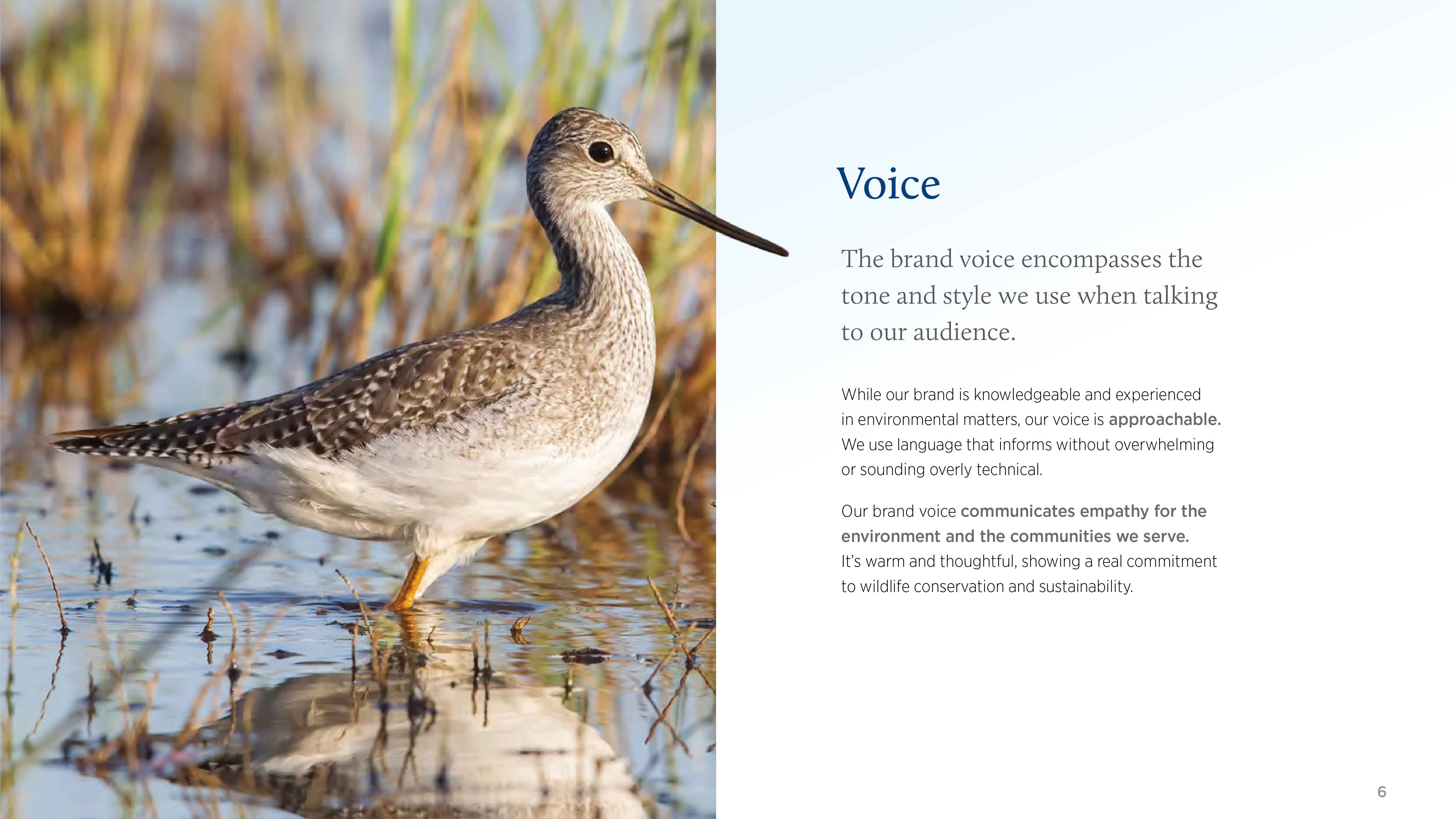
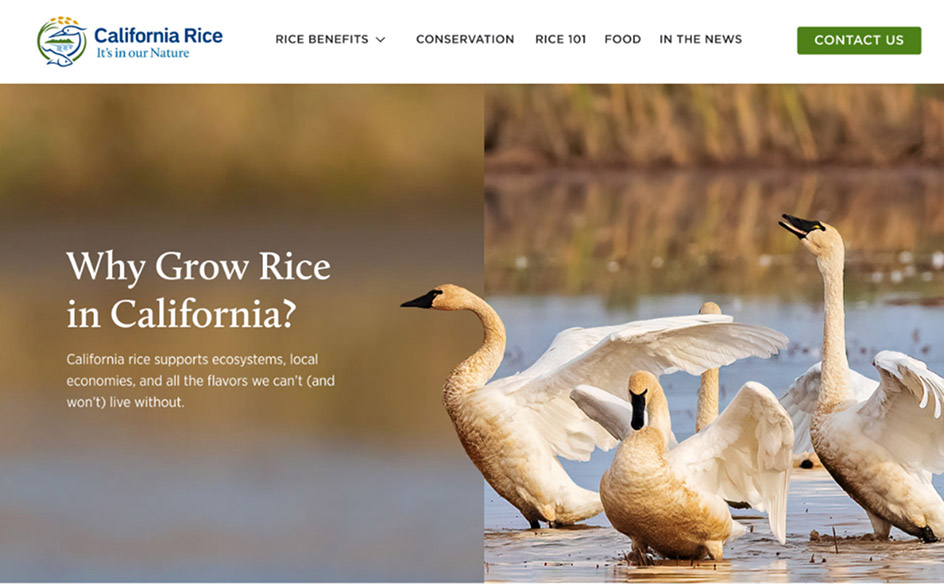
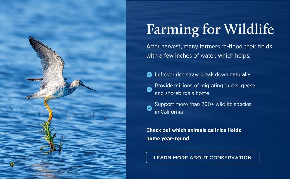
The refreshed brand brought new depth to a familiar symbol. The evolved egret mark now intertwines salmon, rice, and elements of the Central Valley landscape, capturing the deep connection between agriculture, wildlife, and place. Supported by a comprehensive set of brand guidelines and a clear messaging framework, CRC gained the tools to communicate its story with confidence and consistency.
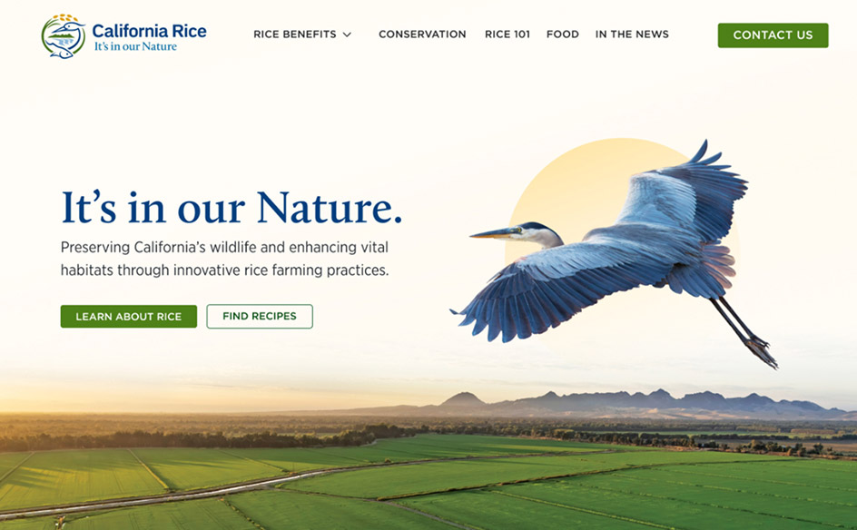
With this foundation in place, the new website became the centerpiece of the brand’s transformation. Designed to educate, inspire, and advocate, the site weaves together CRC’s agricultural roots and environmental mission. Clean design, intuitive navigation, and purposeful storytelling invite visitors to explore how California rice sustains both people and ecosystems, reaffirming CRC’s role as a trusted voice for farmers, wildlife, and the land they share.


Page Design has helped The California Rice Commission take complex information and connect it to visually captivating work that is easily digestible by a larger audience. The Page Design team is helpful, thoughtful and has exceeded in deadlines and design.
Katie Cahill
California Rice Commission
Ready to evolve your brand?
If your organization needs to evolve its brand and tell a bigger story, we can help. From strategy to implementation, we’ll create an identity that honors your roots while preparing you for what’s next.